Advanced transitions – UI Tickets Challenge
As developers, we have always get into situations where the designers require some fancy transitions which look awesome on the design but are extremely difficult to implement. Being a Flutter developer makes it different, makes it fun because we have tools to do it! To prove it in this post, I will continue implementing awesome Buy Tickets design by Dldp and add bottom sheet transitions! Let’s do it!
The design
Starting point
In the previous post, we have created a parallax effect for the cards and created a simple bottom sheet. We will leave the page content untouched, but we will need to remove the bottom sheet and write from scratch. What we need is to have a Stack widget in order to have full control over how the ExhibitionBottomSheet will be placed.
class HomePage extends StatelessWidget { @override Widget build(BuildContext context) { return Scaffold( body: Stack( //<-- main stack children: <Widget>[ SafeArea(...), //<-- content of page ExhibitionBottomSheet(),//<-- bottom sheet ], ), ); }}And let’s have a simple blue sheet so far:
const double minHeight = 120;
class ExhibitionBottomSheet extends StatefulWidget {  @override  _ExhibitionBottomSheetState createState() => _ExhibitionBottomSheetState();}
class _ExhibitionBottomSheetState extends State<ExhibitionBottomSheet>    with SingleTickerProviderStateMixin {
  @override  Widget build(BuildContext context) {    return Positioned(      height: minHeight,      left: 0,      right: 0,      bottom: 0,      child: Container(        padding: const EdgeInsets.symmetric(horizontal: 32),        decoration: const BoxDecoration(          color: Color(0xFF162A49),          borderRadius: BorderRadius.vertical(top: Radius.circular(32)),        ),      ),    );  }}
The Positioned ensures that the element sheet is always expanded horizontally, it is aligned to bottom and has a proper height (which will be changed later on). The Container so far specifies only padding and decoration, which gives us nice rounded corners on top and accurate background color.
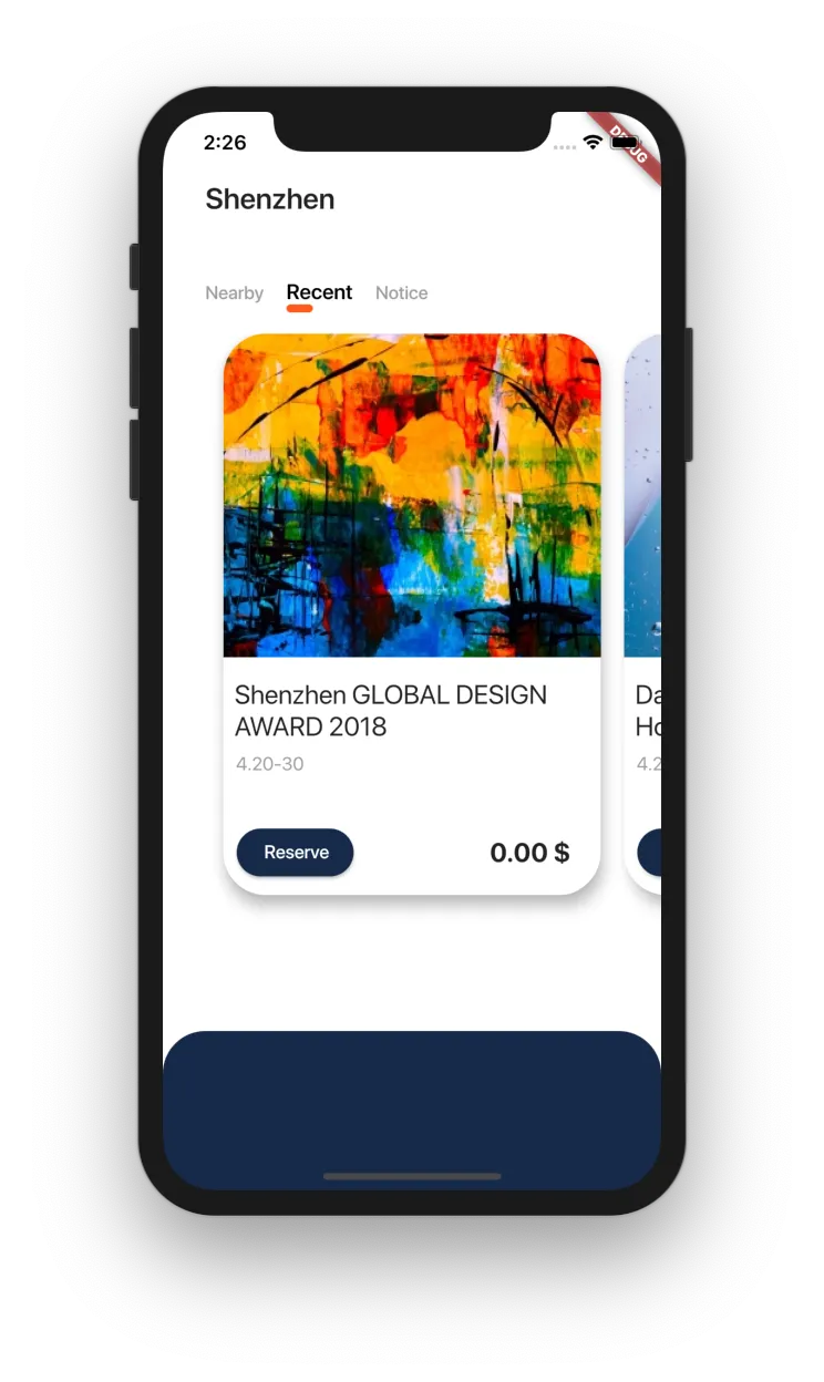
Starting point
Expanding the sheet
The sheet’s height will be defined by AnimationController. We will wrap the whole widget in AnimatedBuilder, because almost every widget in that view will depend on the controller’s value and will need to be rebuilt whenever that value changes. To expand the sheet, we can use AnimatedController.flingmethod, which will basically snap the sheet in a given direction. We can call this method by wrapping the sheet inside the GestureDetector and providing onTap callback:
class _ExhibitionBottomSheetState extends State<ExhibitionBottomSheet>    with SingleTickerProviderStateMixin {  AnimationController _controller; //<-- Create a controller
  double get maxHeight => MediaQuery.of(context).size.height; //<-- Get max height of the screen
  @override  void initState() {    super.initState();    _controller = AnimationController( //<-- initialize a controller      vsync: this,      duration: Duration(milliseconds: 600),    );  }
  @override  void dispose() {    _controller.dispose(); //<-- and remember to dispose it!    super.dispose();  }
  double lerp(double min, double max) =>      lerpDouble(min, max, _controller.value); //<-- lerp any value based on the controller
  @override  Widget build(BuildContext context) {    return AnimatedBuilder( //<--add animated builder      animation: _controller,      builder: (context, child) {        return Positioned(          height: lerp(minHeight, maxHeight), //<-- update height value to scale with controller          left: 0,          right: 0,          bottom: 0,          child: GestureDetector( //<-- add a gesture detector            onTap: _toggle,       //<-- on tap...            child: Container(              ...            ),          ),        );      },    );  }
  void _toggle() {    final bool isOpen = _controller.status == AnimationStatus.completed;    _controller.fling(velocity: isOpen ? -2 : 2); //<-- ...snap the sheet in proper direction  }}
You can also notice we have added a lerp function. This function is just a helper to interpolate a double value between its min and max value based on the controller’s progress. We could probably use Tween instead as it does a similar thing but I find lerp function suiting well here. We can see how the tap causes the sheet transitions between small and big one:
Dragging the sheet
At this moment the user can tap to open the sheet but we also need to provide an option to hold the sheet and manually move it to the top. There are two things we have to keep in mind. The first one is to update the sheet’s height alongside drag updates. The second one is to finish the animation once the user has finished the gesture (he or she can just snap and expect the sheet to get expanded).
Luckily for us, this behavior was implemented in Google’s Gallery App which is open-sourced, so we can borrow the gesture handling from the Google team and use it in our app. 🙂
class _ExhibitionBottomSheetState extends State<ExhibitionBottomSheet>    with SingleTickerProviderStateMixin {  ...  @override  Widget build(BuildContext context) {    return AnimatedBuilder(      ...          child: GestureDetector(            onTap: _toggle,            onVerticalDragUpdate: _handleDragUpdate,  //<-- Add verticalDragUpdate callback            onVerticalDragEnd: _handleDragEnd,        //<-- Add verticalDragEnd callback            child: ...          ),        );      },    );  }
  void _handleDragUpdate(DragUpdateDetails details) {    _controller.value -= details.primaryDelta / maxHeight; //<-- Update the _controller.value by the movement done by user.  }
  void _handleDragEnd(DragEndDetails details) {    if (_controller.isAnimating ||        _controller.status == AnimationStatus.completed) return;
    final double flingVelocity =        details.velocity.pixelsPerSecond.dy / maxHeight; //<-- calculate the velocity of the gesture    if (flingVelocity < 0.0)      _controller.fling(velocity: math.max(2.0, -flingVelocity)); //<-- either continue it upwards    else if (flingVelocity > 0.0)      _controller.fling(velocity: math.min(-2.0, -flingVelocity)); //<-- or continue it downwards    else      _controller.fling(velocity: _controller.value < 0.5 ? -2.0 : 2.0); //<-- or just continue to whichever edge is closer  }}
Now when the user drags the sheet, we can update controller’s value, also when the user ends the drag gesture, we can check it’s velocity and decide whether we want to complete the animation or dismiss it.
Icon and title transitions
I think it’s time to put some content inside our Container. Let’s start with the icon as it’s the easiest one. Since we will need control of every Widget’s position, we will place them inside the Stack. This way we can wrap every Widget in Positioned and specify its position. For the MenuButton it will look like this:
class _ExhibitionBottomSheetState extends State<ExhibitionBottomSheet>    with SingleTickerProviderStateMixin {  ...  @override  Widget build(BuildContext context) {    return ...            child: Container(              padding: const EdgeInsets.symmetric(horizontal: 32),              decoration: const BoxDecoration(                color: Color(0xFF162A49),                borderRadius: BorderRadius.vertical(top: Radius.circular(32)),              ),              child: Stack(           //<-- Add a stack                children: <Widget>[                  MenuButton(),       //<-- With a menu button                ],              ),            ),     ...  }}
class MenuButton extends StatelessWidget {  @override  Widget build(BuildContext context) {    return Positioned(      //<-- Align the icon to bottom right corner      right: 0,      bottom: 24,      child: Icon(        Icons.menu,        color: Colors.white,        size: 28,      ),    );  }}
Now let’s add the SheetHeader. The widget itself will require a fontSize and topMargin in the constructor, as those parameters will change alongside the animation’s state.
class SheetHeader extends StatelessWidget {  final double fontSize;  final double topMargin;
  const SheetHeader(      {Key key, @required this.fontSize, @required this.topMargin})      : super(key: key);
  @override  Widget build(BuildContext context) {    return Positioned(      top: topMargin,      child: Text(        'Booked Exhibition',        style: TextStyle(          color: Colors.white,          fontSize: fontSize,          fontWeight: FontWeight.w500,        ),      ),    );  }}
To pass them, we will create new getters which will depend on the animationController’s value. We are going to need headerTopMargin and headerFontSize:
class _ExhibitionBottomSheetState extends State<ExhibitionBottomSheet>    with SingleTickerProviderStateMixin {
  double get headerTopMargin => lerp(20, 20 + MediaQuery.of(context).padding.top); //<-- Add new property
  double get headerFontSize => lerp(14, 24);    //<-- Add new property
  double lerp(double min, double max) =>      lerpDouble(min, max, _controller.value);
  @override  Widget build(BuildContext context) {    return ...        Stack(          children: <Widget>[            MenuButton(),            SheetHeader(                //<-- Add a header with params              fontSize: headerFontSize,              topMargin: headerTopMargin,            ),          ],        ),     ...  }}
What it means is that for example headerFontSize starts with the value of 14 but the bigger the sheet is, the bigger the font size gets finishing at 24 on a fully expanded sheet.
Now we can see how the icon is placed in the same position but header changes based on transition’s progress:
Icon transitions
It’s time for the main attractions, which are the icons. First, we need to create a model and list of events which will be displayed in the sheet.
final List<Event> events = [  Event('steve-johnson.jpeg', 'Shenzhen GLOBAL DESIGN AWARD 2018', '4.20-30'),  Event('efe-kurnaz.jpg', 'Shenzhen GLOBAL DESIGN AWARD 2018', '4.20-30'),  Event('rodion-kutsaev.jpeg', 'Dawan District Guangdong Hong Kong', '4.28-31'),];
class Event {  final String assetName;  final String title;  final String date;
  Event(this.assetName, this.title, this.date);}
Now let’s think about what we need to do to change the icons from horizontally oriented small ones to vertical big ones. Since we are already using Stack and Positioned we can just adapt icons left and top alignment based on the controller’s value (similarly to the top margin in the title). The only tricky part is to remember, that we need to take event’s index into account so that every next icon is placed more into the right (horizontally) or more into the bottom (vertically). We can also modify the icon’s size and corner rounding. The getter methods should look like this:
const double minHeight = 120;const double iconStartSize = 44;  //<-- add edge valuesconst double iconEndSize = 120;  //<-- add edge valuesconst double iconStartMarginTop = 36;  //<-- add edge valuesconst double iconEndMarginTop = 80;  //<-- add edge valuesconst double iconsVerticalSpacing = 24;  //<-- add edge valuesconst double iconsHorizontalSpacing = 16;  //<-- add edge values
class _ExhibitionBottomSheetState extends State<ExhibitionBottomSheet>    with SingleTickerProviderStateMixin {
  double get itemBorderRadius => lerp(8, 24); //<-- increase item border radius
  double get iconSize => lerp(iconStartSize, iconEndSize); //<-- increase icon size
  double iconTopMargin(int index) =>      lerp(iconStartMarginTop,          iconEndMarginTop + index * (iconsVerticalSpacing + iconEndSize)) +      headerTopMargin; //<-- calculate top margin based on header margin, and size of all of icons above (from small to big)
  double iconLeftMargin(int index) =>      lerp(index * (iconsHorizontalSpacing + iconStartSize), 0); //<-- calculate left margin (from big to small)
  double lerp(double min, double max) =>      lerpDouble(min, max, _controller.value);
  @override  Widget build(BuildContext context) {    return ...      child: Stack(        children: <Widget>[          MenuButton(),          SheetHeader(            fontSize: headerFontSize,            topMargin: headerTopMargin,          ),          for (Event event in events) _buildIcon(event), //<-- Add icons to the stack        ],      ),    ...  }
  Widget _buildIcon(Event event) {    int index = events.indexOf(event); //<-- Get index of the event    return Positioned(      height: iconSize, //<-- Specify icon's size      width: iconSize, //<-- Specify icon's size      top: iconTopMargin(index), //<-- Specify icon's top margin      left: iconLeftMargin(index), //<-- Specify icon's left margin      child: ClipRRect(        borderRadius: BorderRadius.horizontal(          left: Radius.circular(itemBorderRadius), //<-- Set the rounded corners          right: Radius.circular(itemBorderRadius),        ),        child: Image.asset(          'assets/${event.assetName}',          fit: BoxFit.cover,          alignment: Alignment(lerp(1, 0), 0), //<-- Play with alignment for extra style points        ),      ),    );  }}
It’s that simple! Knowing how much space should widgets take, we can calculate the exact position we want them in. And knowing the exact position of the widget, we can pass leftMargin and topMargin to Positioned to get the effect we wanted:
Ticket details
The last part is to add the ticket details once the animation is completed. Since we know the position of icons, we can use it also for the expanded items — this will be easy. Theoretically, we could just decide, that if _controller.status == AnimationStatus.completed, then show the details, otherwise don’t do it. Such an approach would make us lose the opportunity to add some nice fade animations in that process. Instead, we will use AnimatedOpacity so that the expanded item will nicely fade in and fade out when it’s supposed to be displayed or hidden. This is my approach, not sure if it’s the best but at least it’s simple, it is possible that linking the item’s opacity with the controller’s value can provide a better effect. As always, it’s up to you. 🙂
class ExpandedEventItem extends StatelessWidget {  final double topMargin;  final double leftMargin;  final double height;  final bool isVisible;  final double borderRadius;  final String title;  final String date;
  const ExpandedEventItem({    Key key,    this.topMargin,    this.height,    this.isVisible,    this.borderRadius,    this.title,    this.date,    this.leftMargin,  }) : super(key: key);
  @override  Widget build(BuildContext context) {    return Positioned(      top: topMargin,      left: leftMargin,      right: 0,      height: height,      child: AnimatedOpacity(        opacity: isVisible ? 1 : 0,        duration: Duration(milliseconds: 200),        child: Container(          decoration: BoxDecoration(            borderRadius: BorderRadius.circular(borderRadius),            color: Colors.white,          ),          padding: EdgeInsets.only(left: height).add(EdgeInsets.all(8)),          child: _buildContent(),        ),      ),    );  }
  Widget _buildContent() {    return Column(      children: <Widget>[        Text(title, style: TextStyle(fontSize: 16)),        SizedBox(height: 8),        Row(          children: <Widget>[            Text(              '1 ticket',              style: TextStyle(                fontWeight: FontWeight.w500,                fontSize: 12,                color: Colors.grey.shade600,              ),            ),            SizedBox(width: 8),            Text(              date,              style: TextStyle(                fontWeight: FontWeight.w300,                fontSize: 12,                color: Colors.grey,              ),            ),          ],        ),        Spacer(),        Row(          children: <Widget>[            Icon(              Icons.place,              color: Colors.grey.shade400,              size: 16,            ),            Text(              'Science Park 10 25A',              style: TextStyle(                color: Colors.grey.shade400,                fontSize: 13,              ),            )          ],        )      ],    );  }}
The widget is quite long, but it’s mostly just organizing and displaying data — nothing exciting. Depending on what we pass in isVisible parameter, it will cause widget transitions between visible and invisible. If you dive in closely, you can also notice that ExpandedEventItem has margin-left equal to the height. It’s because this widget is meant to be placed under the icon widget. This way we make space for the icon to provide an illusion that it’s a part of the details card.
Now we need to add those details to the main stack before the icons, so they will be rendered under them. We will also modify rounding corners to match the designs.
class _ExhibitionBottomSheetState extends State<ExhibitionBottomSheet>    with SingleTickerProviderStateMixin {
  double get itemBorderRadius => lerp(8, 24);
  double get iconLeftBorderRadius => itemBorderRadius; //<-- Left border radius stays the same
  double get iconRightBorderRadius => lerp(8, 0); //<-- Right border radius lerps to 0 instead.
  @override  Widget build(BuildContext context) {    return ...      child: Stack(        children: <Widget>[          MenuButton(),          SheetHeader(            fontSize: headerFontSize,            topMargin: headerTopMargin,          ),          for (Event event in events) _buildFullItem(event), //<-- Add FullItems          for (Event event in events) _buildIcon(event),        ],      ),    ...    );  }
  Widget _buildIcon(Event event) {    ...    child: ClipRRect(      borderRadius: BorderRadius.horizontal(        left: Radius.circular(iconLeftBorderRadius),  //<-- update border radius        right: Radius.circular(iconRightBorderRadius), //<-- update border radius      ),    ...  }
  Widget _buildFullItem(Event event) {    int index = events.indexOf(event);    return ExpandedEventItem(      topMargin: iconTopMargin(index), //<--provide margins and height same as for icon      leftMargin: iconLeftMargin(index),      height: iconSize,      isVisible: _controller.status == AnimationStatus.completed, //<--set visibility      borderRadius: itemBorderRadius, //<-- pass border radius      title: event.title, //<-- data to be displayed      date: event.date, //<-- data to be displayed    );  }}
And that’s it!
Now before we compare the results, let me point out that in this post I focused only on implementing the effects from the design. If you would like to use it in your own app, I would advise adding limits on how many items you display in horizontal view (as they would go over the menu button). Also, I would replace the whole view with the
ListViewwhen the sheet is fully open. Right now those elements are not scrollable but I guess they should be. 🙂
PLACEHOLDER
The design
The implementation
I hope you enjoyed going through the process with me and that you feel ready to implement it in your app as well. 🙂
If you find this post helpful, please share it with others, so they can learn too!
You can find the full code on the GitHub repository (feel free to leave a Star if you like it).
Cheers 🙂
Be sure to check out the previous post where I implemented parallax cards from the same design and other UI Challenges on my blog in here!