Water Drop effect in Flutter
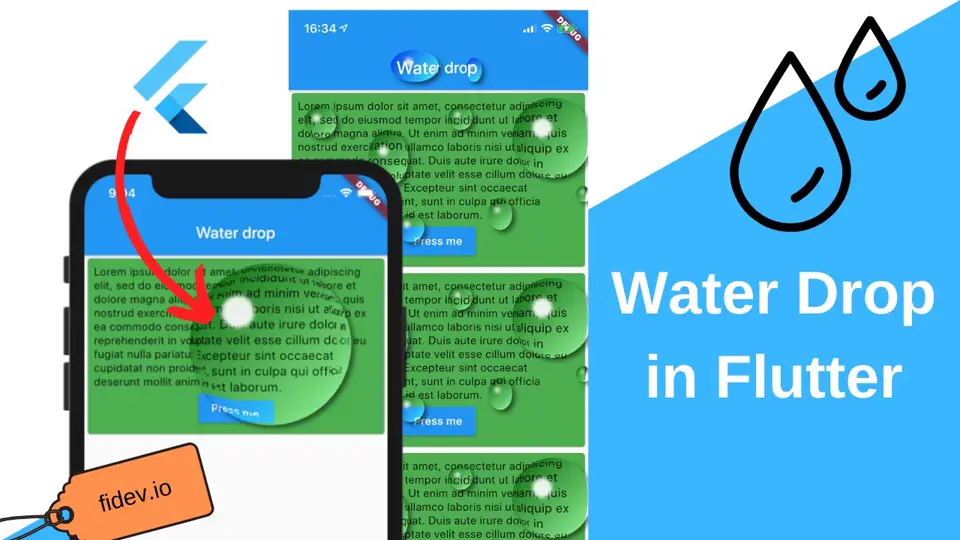
In this post, I’d like to share with you how to achieve a water drop effect in Flutter. Why would you spend your time learning such skill? Well, I have no idea but it looks cool so let’s get started! 😀
TLDR: If you don’t care how it’s done and just wanna add water drops, use the water_drop package.
How it will work
The easiest to use solution would be to put an OverlayEntry on top of everything, which would just alternate what’s beneath it. Unfortunately, to achieve this effect, we need to get a child on which we are putting our water drops. Because of that, it will be much easier if we just use Stack and put the drops on top of the child.
For each drop we are going to specify 4 main parameters: left, top, width and height. They are defining the position and size of the drop relative to the child, so if we want to have a 100px by 100px drop in the top left corner, we pass left and top as zeros, and height and width as 100s.
We also want to provide a Widget which will allow developers to easily add multiple drops (like in the video at the beginning of this article), so we will use a Stack in which we will add _WaterDrops for each WaterDropParam:
class WaterDropParam {  final double top;  final double left;  final double width;  final double height;  ...}
class WaterDrop extends StatelessWidget {  final List<WaterDropParam> params;  final Widget child;
  const WaterDrop({    Key key,    @required this.params,    @required this.child,  });
  @override  Widget build(BuildContext context) {    return Stack(      children: <Widget>[        child,        ...params.map((param) => _WaterDrop(              child: child,              left: param.left,              top: param.top,              width: param.width,              height: param.height,            )),      ],    );  }}
Cutting out the drop
At first, we need to take only the part of the widget we are going to use. To do that, we can use ClipPath widget with our own CustomClipper. It allows us to… well… cut out the portion of the widget. 😀 We will start with creating very simple OvalClipper which will take care of defining what to cut out and what to leave:
class OvalClipper extends CustomClipper<Path> {  final double height;  final double width;  final Offset center;
  OvalClipper({this.center, this.width, this.height});
  @override  Path getClip(Size size) {    Path path = Path()      ..addOval(Rect.fromCenter(        center: center,        width: width,        height: height,      ));    return path;  }
  @override  bool shouldReclip(CustomClipper<Path> oldClipper) => true;}
To use it, we need to pass the OvalClipper in ClipPath widget just like in the code below. We also need to specify clipBehavior to Clip.hardEdge – this will prevent us from getting undesired artifacts later on. We put everything inside the Stack as we will add more elements below and above the ClipPath soon and we wrap everything in an IgnorePointer so that the water drop doesn’t interfere with user’s gestures.
class _WaterDrop extends StatefulWidget {  final double top;  final double left;  final double width;  final double height;  final Widget child;
  const _WaterDrop(      {Key key, this.child, this.top, this.width, this.left, this.height})      : super(key: key);
  @override  __WaterDropState createState() => __WaterDropState();}
class __WaterDropState extends State<_WaterDrop> {  @override  Widget build(BuildContext context) {    return IgnorePointer(      child: Stack(        children: <Widget>[          ClipPath(            clipper: OvalClipper(         //<-- Use the clipper              center: center,              width: widget.width,              height: widget.height,            ),            clipBehavior: Clip.hardEdge,  //<-- This is important!            child: widget.child,          ),        ],      ),    );  }
  ///Get center of a drop  Offset get center => Offset(        widget.left + widget.width / 2,        widget.top + widget.height / 2,      );}
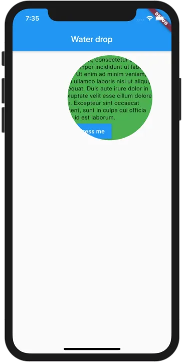
Right now we are not altering the cut out drop at all, so it’s not even noticeable that we do something, but if we remove the original child from the Stack for a moment, we can see how our cut out looks like:
Gradient overlay
Why do we actually think that something is a water drop? Mostly because the light looks different there. So we need to add some minor changes which will imitate that in this place, something special is taking place. We will start by putting a LinearGradient on top of our drop.
We’d like to have the gradient start in the top left corner with black color and smoothly change to white in the bottom right corner. At start, it seems rather easy, we just use BoxDecoration with LinearGradient, set the begin to Alignment.topLeft and the end to Alignment.bottomRight and we’re good! Well, it’s not that simple. 🙁 If we wrap our child (even cut out) with the gradient, the topLeft will be pointing to the top left corner of the whole widget (in our case a Card), not the drop itself! If we want to have the gradient just over the drop, we need to calculate the alignment by ourselves.
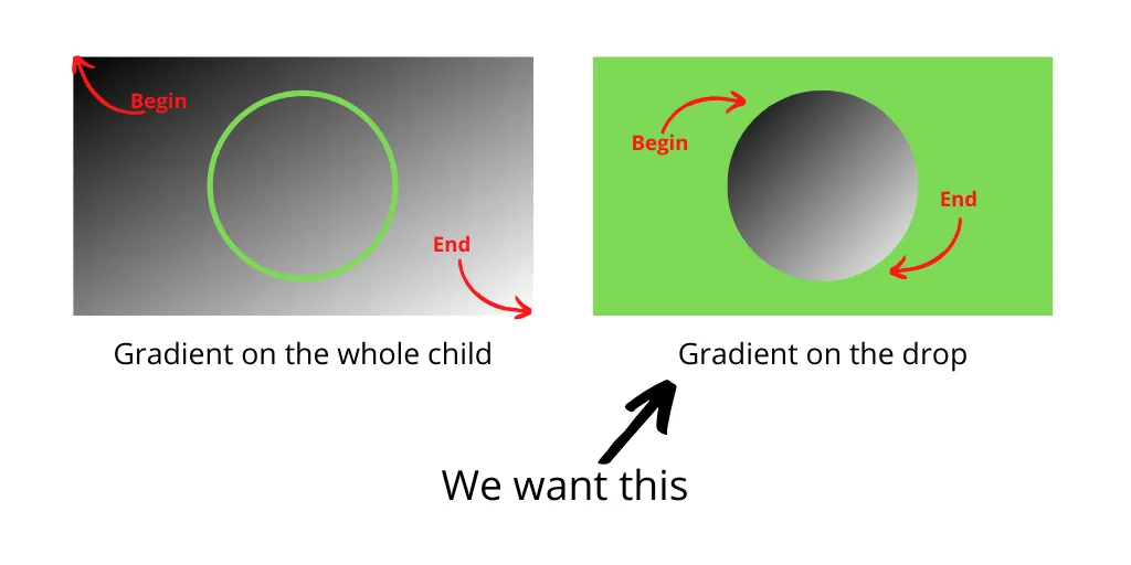
How do we do it then? Well, we just need to implement the following steps:
- Get the size of the whole widget
- Get the center of the drop (based on
WaterDropParams) - Calculate the relative position of the center inside the whole widget
- Calculate the relative height and width inside the whole widget
- Subtract the relative height and width from the relative center to get the begin
- Add he relative height and width from the relative center to get the end
It may look like there’s a lot of work but the following code does it all:
class __WaterDropState extends State<_WaterDrop> {  ///Size of a child widget. It is needed to provide correct gradient on the drop.  Size totalSize;
  @override  Widget build(BuildContext context) {    //After build, rebuild it again but save the size of a widget (see [totalSize])    if (totalSize == null) {      SchedulerBinding.instance.addPostFrameCallback((_) {        setState(() => totalSize = context.size);      });    }    //If there's no totalSize, use size of the screen    final size = totalSize ?? MediaQuery.of(context).size;
    //Alignment of center    final alignment = getAlignment(size);
    //used for determining alignments for gradient    final alignmentModifier = Alignment(      widget.width / size.width,      widget.height / size.height,    );
    final begin = alignment - alignmentModifier;    final end = alignment + alignmentModifier;
    return ...  }
  ///Get center of a drop  Offset get center => Offset(        widget.left + widget.width / 2,        widget.top + widget.height / 2,      );
  ///Map Center and Size to Alignment  Alignment getAlignment(Size size) => Alignment(        (center.dx - size.width / 2) / (size.width / 2),        (center.dy - size.height / 2) / (size.height / 2),      );}
Once we have the alignments, all we need to do is wrap our child in Container with BoxDecoration. What’s important here is that we need to set backgroundBlendMode to BlendMode.overlay. This way our gradient will not just cover the water drop but it will “merge” with it and be much more subtle.
//A child with gradient on it for light illusionWidget childWithGradient = Container(  foregroundDecoration: BoxDecoration(    gradient: LinearGradient(      begin: begin,      end: end,      colors: [Colors.black, Colors.white],    ),    backgroundBlendMode: BlendMode.overlay, //<--- Use BlendMode.overlay!  ),  child: widget.child,);
return IgnorePointer(  child: Stack(    children: <Widget>[      ClipPath(        clipper: ...,        clipBehavior: Clip.hardEdge,        child: childWithGradient,     //<-- replace the child!      ),    ],  ),);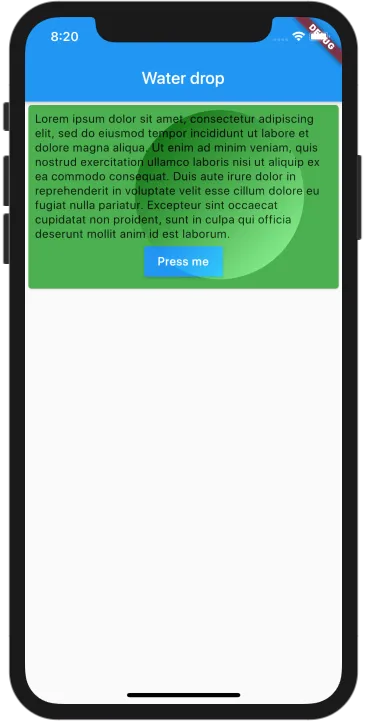
Light and shadow
Now let’s add a minor light reflection above the drop and shadow beneath it. Since we know the left, top, height and width of the drop, we can just use Positioned to specify the position and size of both the shadow and the light. Putting them inside the Stack will also allow us to have the shadow under the drop and the light on top of it.
///A white dot in top left cornerclass _LightDot extends StatelessWidget {  final double top;  final double left;  final double width;  final double height;
  const _LightDot({Key key, this.top, this.left, this.width, this.height})      : super(key: key);
@override Widget build(BuildContext context) { return Positioned( left: left + width / 5, top: top + height / 5, width: width / 5, height: height / 5, child: DecoratedBox( decoration: BoxDecoration( shape: BoxShape.circle, boxShadow: [ BoxShadow( blurRadius: 3, color: Colors.white.withOpacity(0.9), ), ], ), ), ); }}///A shadow below the dropclass _OvalShadow extends StatelessWidget { final double top; final double left; final double width; final double height;
const _OvalShadow({Key key, this.top, this.left, this.width, this.height}) : super(key: key);
@override Widget build(BuildContext context) { return Positioned( left: left, top: top, width: width, height: height, child: DecoratedBox( decoration: BoxDecoration( borderRadius: BorderRadius.all( Radius.elliptical(width / 2, height / 2), ), boxShadow: [ BoxShadow( blurRadius: 4, offset: Offset(4, 4), color: Colors.black.withOpacity(0.5), ), ], ), ), ); }}Now we only need to put them inside the Stack:
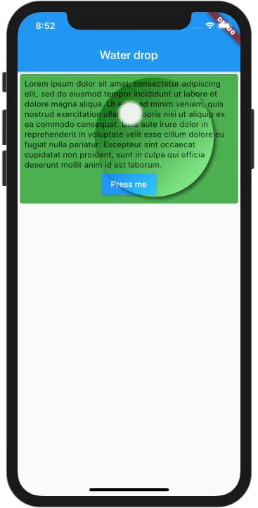
return IgnorePointer( child: Stack( children: <Widget>[ _OvalShadow( //<-- put the shadow under the drop left: widget.left, top: widget.top, width: widget.width, height: widget.height, ), ClipPath( clipper: OvalClipper( center: center, width: widget.width, height: widget.height, ), clipBehavior: Clip.hardEdge, child: childWithGradient, ), _LightDot( //<-- put the light on top of the drop left: widget.left, top: widget.top, width: widget.width, height: widget.height, ), ], ),);And now it will look like this:
Distortion effect
Now it’s time to create a distortion effect where the view inside a bubble is a bit bigger and where it kinda bends on the edges of the drop. Surprisingly, it is very simple to achieve such a result.
What we can do, is put a few layers on top of each other. Each layer of the drop will be a bit smaller (the radius of the cutout will be smaller) but the content inside will be a bigger (we will scale what’s inside). If we have a several layers like that, it will create a zooming effect. If those layers will be different by a small factor, the whole effect will look very smooth. The code for this is very simple. All we have to do is generate around 8 ClipPaths, each having smaller width and height. Then we wrap each of them in Transform.scale to create zooming effect:
...List.generate(8, (i) { //<-- generate 8 children return Transform.scale( scale: 1 + 0.02 * i, //<-- Scale each one alignment: alignment, child: ClipPath( clipper: OvalClipper( center: center, width: widget.width * (1 - 0.04 * i), //<-- Clip with different size height: widget.height * (1 - 0.04 * i), ), clipBehavior: Clip.hardEdge, child: childWithGradient, ), );}),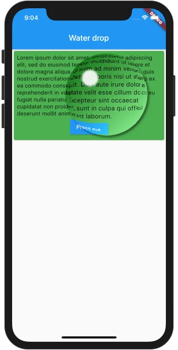
What’s worth noting here is that we are having 8 extra builds for each drop. It can cause performance problems so please think twice before using it! Especially if you want to wrap the whole page in it!
And that’s it!
Now we can add more WaterDrops and even bind the parameters with the AnimationController to make them move:
As always, the whole code is on the Github: https://github.com/MarcinusX/water_drop
You can also just use it as a package: https://pub.dev/packages/water_drop
Cheers! 💙