BMI Calculator in Flutter – Part 5 – Animated Slider Hint
Hi again! It’s about time to add some more code to the BMI Calculator app – by Johny Vino’s design. In this post, I will start creating bottom Pacman slider (see below). I will go through implementing the animated hint which will indicate user on how to use the slider. Let’s make it happen! 🙂
As always, let me show you the effect we want to achieve first. This time I am going to show you the exact result widget from this development instead of the design:
Static widgets
First, let’s create static aspects of this view, PacmanIcon and Dot are simple stateless widgets to be displayed. Since we are going to have 2 sizes of dots, the size will be parametrized:
class Dot extends StatelessWidget {  final double size;
  const Dot({Key key, @required this.size}) : super(key: key);
  @override  Widget build(BuildContext context) {    return Container(      height: screenAwareSize(size, context),      width: screenAwareSize(size, context),      decoration: BoxDecoration(        shape: BoxShape.circle,        color: Colors.white,      ),    );  }}
class PacmanIcon extends StatelessWidget {  @override  Widget build(BuildContext context) {    return Padding(      padding: EdgeInsets.only(        right: screenAwareSize(16.0, context),      ),      child: SvgPicture.asset(        'images/pacman.svg',        height: screenAwareSize(25.0, context),        width: screenAwareSize(21.0, context),      ),    );  }}
We are going to place those widgets inside rows and paddings:
class PacmanSlider extends StatefulWidget {  @override  _PacmanSliderState createState() => _PacmanSliderState();}
class _PacmanSliderState extends State<PacmanSlider> {  final int numberOfDots = 10;  final double minOpacity = 0.1;  final double maxOpacity = 0.5;
  @override  Widget build(BuildContext context) {    return Container(      height: screenAwareSize(52.0, context),      width: double.infinity,      decoration: BoxDecoration(        borderRadius: BorderRadius.all(Radius.circular(8.0)),        color: Theme.of(context).primaryColor,      ),      child: Padding(        padding: EdgeInsets.symmetric(          horizontal: screenAwareSize(24.0, context),        ),        child: Row(          children: <Widget>[            PacmanIcon(),            Expanded(child: _drawDots()),          ],        ),      ),    );  }
  Widget _drawDots() {    return Row(      mainAxisAlignment: MainAxisAlignment.spaceBetween,      children: List.generate(numberOfDots, _generateDot)        ..add(Opacity(          opacity: maxOpacity,          child: Dot(size: 14.0),        )),    );  }
  Widget _generateDot(int dotNumber) {    return Dot(size: 9.0);  }}
The outer Container specifies slider’s height and decoration (with shape and color) – nothing interesting here.
The main body of the widget is a Row with pacman and dots. To create the middle dots, we used List.generate – it allows us to generate any list (in our case a list of widgets) using simple generator (_generateDot) method. We can also add the bigger dot at the end of the list. Notice that we already specified Opacity for that dot, the middle ones will be animated later on. Let’s take a sneak peek on what we have:

AnimationController
Now let’s add the animation controller, which will be responsible for changing dots’ opacity. For now, we can assume that this controller’s animation will take 1 second and after another 800 milliseconds, it will run again from scratch. At this point, we can also wrap middle dots with AnimatedBuilder, so that they will be rebuilt alongside animation changes. Let’s take a look at the code:
class _PacmanSliderState extends State<PacmanSlider>    with TickerProviderStateMixin {  final int numberOfDots = 10;  final double minOpacity = 0.1;  final double maxOpacity = 0.5;  AnimationController hintAnimationController;
  @override  void initState() {    super.initState();    _initHintAnimationController();    hintAnimationController.forward();  }
  @override  void dispose() {    hintAnimationController.dispose();    super.dispose();  }
  void _initHintAnimationController() {    hintAnimationController = AnimationController(      vsync: this,      duration: Duration(milliseconds: 1000),    );    hintAnimationController.addStatusListener((status) {      if (status == AnimationStatus.completed) {        Future.delayed(Duration(milliseconds: 800), () {          hintAnimationController.forward(from: 0.0);        });      }    });  }
  Widget _generateDot(int dotNumber) {    return AnimatedBuilder(      animation: hintAnimationController,      builder: (context, child) => Opacity(            opacity: hintAnimationController.value,            child: child,          ),      child: Dot(size: 9.0),    );  }  ...}
At this point it looks like this:
Intervals
As you can see, at this point every dot is animated at the same time. I guess it’s a bad hint to swipe right. Theoretically, we could create a list of AnimationControllers and have them be delayed from each other by a small amount of time, but I don’t think it would be an optimal solution. The approach I went with is the same I used for Flight Search challenge – Intervals. Intervals are a special kind of animation curves that allow us to “use” only a part of AnimationController. We can specify at what point of our parent animation we want interval animation to begin and end.
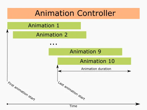
Intervals concept
Let’s take a look at how it looks in code:
Widget _generateDot(int dotNumber) {  Animation animation = _initDotAnimation(dotNumber);  return AnimatedBuilder(    animation: animation,    builder: (context, child) => Opacity(          opacity: animation.value,          child: child,        ),    child: Dot(size: 9.0),  );}
Animation<double> _initDotAnimation(int dotNumber) {  double lastDotStartTime = 0.3;  double dotAnimationDuration = 0.6;  double begin = lastDotStartTime * dotNumber / numberOfDots;  double end = begin + dotAnimationDuration;  return Tween(begin: minOpacity, end: maxOpacity).animate(    CurvedAnimation(      parent: hintAnimationController,      curve: Interval(begin, end),    ),  );}
Notice that we also specified Twin in which we defined the minimum and maximum values for the animations. Now we can see that dots appear one after another:
Sinusoidal animation
We are very close to the final effect, now we have to deal with the following problem: After a dot is animated it stays in the maximum state but it should get back to the minimum. Unfortunately, Tween animations will always give us a curve from begin to end and we need it to go from min to max to minagain. How to deal with that problem? Create our own Animation!
class SinusoidalAnimation extends Animatable<double> {  SinusoidalAnimation({this.min, this.max});
  final double min;  final double max;
  @override  double transform(double t) {    return min + (max - min) * math.sin(math.pi * t);  }}
This animation will provide sinusoidal behavior of the value so that every dot will nicely get from minOpacity to maxOpacity and then return back to minOpacity. The only thing left now is replacing Tween with our new animation and tweaking up the parameters to have the look we want:
Animation<double> _initDotAnimation(int dotNumber) { double lastDotStartTime = 0.4; double dotAnimationDuration = 0.6; double begin = lastDotStartTime * dotNumber / numberOfDots; double end = begin + dotAnimationDuration; return SinusoidalAnimation(min: minOpacity, max: maxOpacity).animate( CurvedAnimation( parent: hintAnimationController, curve: Interval(begin, end), ), );}And that’s it!
You can find the full code for this stage on GitHub.
Cheers 🙂