BMI Calculator in Flutter – Part 3 – Height
Hi again! It’s time for another part of BMI Calculator in Flutter, a series in which I implement Johny Vino‘s awesome BMI Calculator design (if you didn’t see previous posts, you can find them here). This time I will go through the implementation of height picker using GestureDetector. Let’s see how it goes 🙂
Design
First, let me show you the original design:
It looks nice, doesn’t it? However, during the development process with Johny, we agreed to make some changes to the design. In this post, I will try to temporarily combine both old and new design.
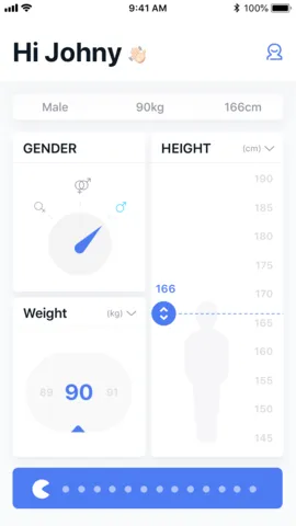
The new design
The current state
Setup
At first, we need to add a title to the card. We will use CardTitle widget created earlier and put it inside HeightCard widget:
import 'package:bmi_calculator/card_title.dart';import 'package:bmi_calculator/widget_utils.dart';import 'package:flutter/material.dart';
class HeightCard extends StatefulWidget {  final int height;
  const HeightCard({Key key, this.height}) : super(key: key);
  @override  HeightCardState createState() => HeightCardState();}
class HeightCardState extends State<HeightCard> {  int height;
  @override  void initState() {    super.initState();    height = widget.height ?? 170;  }
  @override  Widget build(BuildContext context) {    return Card(      child: Padding(        padding: EdgeInsets.only(top: screenAwareSize(16.0, context)),        child: Column(          crossAxisAlignment: CrossAxisAlignment.center,          children: <Widget>[            CardTitle("HEIGHT", subtitle: "(cm)"),            //TODO: add height picker          ],        ),      ),    );  }}
You can notice that I am using screenAwareSize method. It is a method I created to have sizes of widgets adapt to screen size. You can read more about it in the first post of the series.
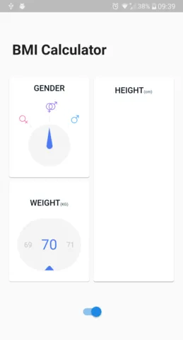
Card title
Height picker widget
The interesting part of this task is that we will have to work a lot on the widget’s actual height. To view that height, we will use LayoutBuilder. LayoutBuildergives us access to view constraints so that we can use the widget’s height.
Another thing worth mentioning is that we want the HeightCard widget to be the one which stores actual height. To cope with that, we will pass the height to the HeightPicker and listen to changes with ValueChanged<int>. This way we won’t get lost on where is the actual height stored.
Placement of HeightPicker:
...CardTitle("HEIGHT", subtitle: "(cm)"),Expanded( child: Padding( padding: EdgeInsets.only(bottom: screenAwareSize(8.0, context)), child: LayoutBuilder(builder: (context, constraints) { return HeightPicker( widgetHeight: constraints.maxHeight, height: height, onChange: (val) => setState(() => height = val), ); }), ),),...Actual HeightPicker:
import 'package:flutter/material.dart';
class HeightPicker extends StatefulWidget {  final int maxHeight;  final int minHeight;  final int height;  final double widgetHeight;  final ValueChanged<int> onChange;
  const HeightPicker(      {Key key,      this.height,      this.widgetHeight,      this.onChange,      this.maxHeight = 190,      this.minHeight = 145})      : super(key: key);
  int get totalUnits => maxHeight - minHeight;
  @override  _HeightPickerState createState() => _HeightPickerState();}
class _HeightPickerState extends State<HeightPicker> {  @override  Widget build(BuildContext context) {    return Center(child: Text("height picker"));  }}
Labels on the right
Let’s start with displaying labels on the right. We want them to be evenly distributed and to display values from minHeight to maxHeight incremented by 5.
class _HeightPickerState extends State<HeightPicker> {  @override  Widget build(BuildContext context) {    return Stack(      children: <Widget>[        _drawLabels(),      ],    );  }
  Widget _drawLabels() {    int labelsToDisplay = widget.totalUnits ~/ 5 + 1;    List<Widget> labels = List.generate(      labelsToDisplay,      (idx) {        return Text(          "${widget.maxHeight - 5 * idx}",          style: labelsTextStyle,        );      },    );
    return Align(      alignment: Alignment.centerRight,      child: IgnorePointer(        child: Padding(          padding: EdgeInsets.only(            right: screenAwareSize(12.0, context),            bottom: marginBottomAdapted(context),            top: marginTopAdapted(context),          ),          child: Column(            children: labels,            mainAxisAlignment: MainAxisAlignment.spaceBetween,          ),        ),      ),    );  }}
What we did:
- We used
Stackas a main widget’s container. Stack will be handy later on when we will have more widgets to display. - We specified how many labels we want to display. The assumption is that the total number of units is dividable by 5.
- We used
List.generateto create a list of texts displaying each label. - We used
AlignwithAlignment.centerRightso that our labels will stick to the right. - We used
IgnorePainterwhich causes the widget to ignore all gestures on it. It will be useful later on but I’d like to add it now so that we won’t have to come back to labels in the further process. - We used
Columnand placed labels inside it. We specifiedMainAxisAlignment.spaceBetweento make the labels distribute evenly but also do not have any unnecessary margins on the edges.
You can notice, that I am using unknown things like marginBottomAdapted or labelsTextStyle. They are coming from height_styles.dart file where I store all reusable values, colors, etc.
import 'package:bmi_calculator/widget_utils.dart';import 'package:flutter/material.dart';
export 'package:bmi_calculator/styles.dart';
double marginBottomAdapted(BuildContext context) => screenAwareSize(marginBottom, context);
double marginTopAdapted(BuildContext context) => screenAwareSize(marginTop, context);
const TextStyle labelsTextStyle = const TextStyle(  color: labelsGrey,  fontSize: labelsFontSize,);
const double marginBottom = 16.0;const double marginTop = 26.0;const double labelsFontSize = 13.0;const Color labelsGrey = const Color.fromRGBO(216, 217, 223, 1.0);
The result looks like this:
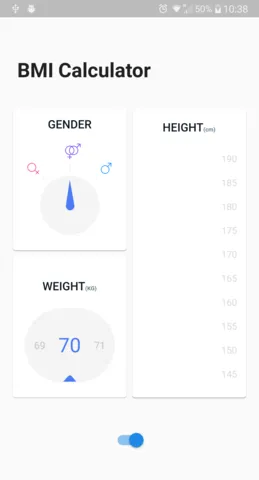
The labels
Height slider
Next widget we should develop is HeightSlider which is the indicator of the selected height. It contains 3 elements: label, circle, and line.
But first, let me explain how the slider will be placed. We will use Positionedwidget which will specify the slider’s position from the bottom. To do that we will need to do the following things:
- Calculate
drawingHeightwhich is the distance in pixels between the middle of the lowest label and middle of the highest label. - Having
drawingHeight, we can calculatepixelsPerUnitwhich will represent how many pixels are there between two units of height. - Last, we can calculate
sliderPositionwhich defines where should the slider be placed.
Let’s see the code of how HeightSlider will be placed:
class _HeightPickerState extends State<HeightPicker> {  double get _pixelsPerUnit {    return _drawingHeight / widget.totalUnits;  }
  double get _sliderPosition {    double halfOfBottomLabel = labelsFontSize / 2;    int unitsFromBottom = widget.height - widget.minHeight;    return halfOfBottomLabel + unitsFromBottom * _pixelsPerUnit;  }
  ///returns actual height of slider to be able to slide  double get _drawingHeight {    double totalHeight = widget.widgetHeight;    double marginBottom = marginBottomAdapted(context);    double marginTop = marginTopAdapted(context);    return totalHeight - (marginBottom + marginTop + labelsFontSize);  }
  @override  Widget build(BuildContext context) {    return Stack(      children: <Widget>[        _drawSlider(),        _drawLabels(),      ],    );  }
  Widget _drawSlider() {    return Positioned(      child: HeightSlider(height: widget.height),      left: 0.0,      right: 0.0,      bottom: _sliderPosition,    );  }  ...}
And now we can look into actual HeightSlider code:
class HeightSlider extends StatelessWidget {  final int height;
  const HeightSlider({Key key, this.height}) : super(key: key);
  @override  Widget build(BuildContext context) {    return IgnorePointer(      child: Column(        crossAxisAlignment: CrossAxisAlignment.start,        children: <Widget>[          SliderLabel(height: height),          Row(            children: <Widget>[              SliderCircle(),              Expanded(child: SliderLine()),            ],          ),        ],      ),    );  }}
Not much to look on, right? Let’s look at what’s inside.
SliderLine
class SliderLine extends StatelessWidget { @override Widget build(BuildContext context) { return Row( mainAxisAlignment: MainAxisAlignment.spaceEvenly, mainAxisSize: MainAxisSize.max, children: List.generate( 40, (i) => Expanded( child: Container( height: 2.0, decoration: BoxDecoration( color: i.isEven ? Theme.of(context).primaryColor : Colors.white), ), )), ); }}It appears that drawing a dashed line is not as trivial as it sounds. Luckily, we can create a Row with 40 Containers, every second one colored in blue. With proper alignment and size this is what we got:
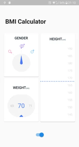
Slider line
SliderCircle
class SliderCircle extends StatelessWidget { @override Widget build(BuildContext context) { return Container( width: circleSizeAdapted(context), height: circleSizeAdapted(context), decoration: BoxDecoration( color: Theme.of(context).primaryColor, shape: BoxShape.circle, ), child: Icon( Icons.unfold_more, color: Colors.white, size: 0.6 * circleSizeAdapted(context), ), ); }}The circle is a simple Container with BoxShape.circle and an Icon inside. The size is coming from height_styles.dart and is equal to 32.0. If we add this code to the slider, we end up with this:
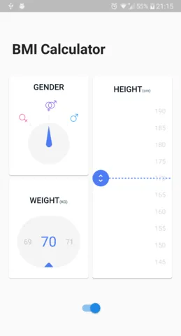
Slider circle
SliderLabel
The only part left is a label. I don’t think there is anything worth explaining here:
class SliderLabel extends StatelessWidget {  final int height;
  const SliderLabel({Key key, this.height}) : super(key: key);
  @override  Widget build(BuildContext context) {    return Padding(      padding: EdgeInsets.only(        left: screenAwareSize(4.0, context),        bottom: screenAwareSize(2.0, context),      ),      child: Text(        "$height",        style: TextStyle(          fontSize: selectedLabelFontSize,          color: Theme.of(context).primaryColor,          fontWeight: FontWeight.w600,        ),      ),    );  }}
And that’s the whole slider:
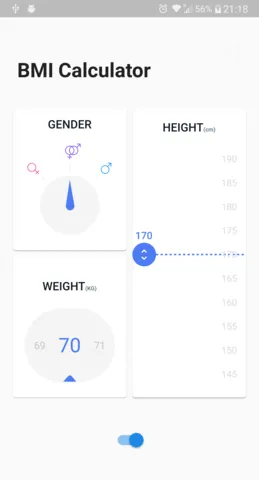
The slider
Person preview
Now let’s add a person image that will scale with the slider. Since we have access to the asset and we already can calculate the position of the slider, this task should be easy. All we need to do is draw an svg image with the height equal to slider position plus a bottom margin. Then we need to align the image to the bottom and that’s it.
...  @override  Widget build(BuildContext context) {    return Stack(      children: <Widget>[        _drawPersonImage(),        _drawSlider(),        _drawLabels(),      ],    );  }
  Widget _drawPersonImage() {    double personImageHeight = _sliderPosition + marginBottomAdapted(context);    return Align(      alignment: Alignment.bottomCenter,      child: SvgPicture.asset(        "images/person.svg",        height: personImageHeight,        width: personImageHeight / 3,      ),    );  }...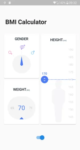
Person image
Gestures
And now it’s time for la grande finale: picking the height. What we need to do is handle taps and vertical drags to allow the user to change the height. While doing that we have to detect the position of the events so that we can map it the actual values. We will use GestureDetector widget for that.
Taps
Unfortunately, GestureDetector’s GestureTapCallback, which is used as onTap parameter, does not provide information about the position of the event. Because of that, we will use onTapDown which provides GestureTapDownDetails. Let’s take a look into the code:
...  @override  Widget build(BuildContext context) {    return GestureDetector(      behavior: HitTestBehavior.translucent,      onTapDown: _onTapDown,      child: Stack(        children: <Widget>[          _drawPersonImage(),          _drawSlider(),          _drawLabels(),        ],      ),    );  }
  _onTapDown(TapDownDetails tapDownDetails) {    int height = _globalOffsetToHeight(tapDownDetails.globalPosition);    widget.onChange(_normalizeHeight(height));  }
  int _normalizeHeight(int height) {    return math.max(widget.minHeight, math.min(widget.maxHeight, height));  }
  int _globalOffsetToHeight(Offset globalOffset) {    RenderBox getBox = context.findRenderObject();    Offset localPosition = getBox.globalToLocal(globalOffset);    double dy = localPosition.dy;    dy = dy - marginTopAdapted(context) - labelsFontSize / 2;    int height = widget.maxHeight - (dy ~/ _pixelsPerUnit);    return height;  }...
Now we can break down how we map position to the height value:
- Get the global position of gesture from
tapDownDetails. - Take the
RenderBoxfrom context. - Parse global position to a local one.
- Take the
ycomponent of the offset. We need to remember that it is increasing down the screen (top = 0.0). - Since the local position is connected to whole
HeightPickerwidget, we should subtract the top margin and half of the label size. This way the maximum height value (190) can be our reference point. - Divide the number of pixels from the top by the number of pixels per unit, so that we have the number of units from the top.
- Subtract the number of units from the top from the maximum height.
- Normalize the obtained value, so that it is between the maximum and the minimum height.
- Look how the taps are handled 🙂
Vertical drags
Now we can add handling vertical drags. We will use two callbacks from the gesture detector: onVerticalDragStart and onVerticalDragUpdate. Let’s see the code first:
class _HeightPickerState extends State<HeightPicker> {  double startDragYOffset;  int startDragHeight;...    return GestureDetector(      behavior: HitTestBehavior.translucent,      onTapDown: _onTapDown,      onVerticalDragStart: _onDragStart,      onVerticalDragUpdate: _onDragUpdate,      ...    );...  _onDragStart(DragStartDetails dragStartDetails) {    int newHeight = _globalOffsetToHeight(dragStartDetails.globalPosition);    widget.onChange(newHeight);    setState(() {      startDragYOffset = dragStartDetails.globalPosition.dy;      startDragHeight = newHeight;    });  }
  _onDragUpdate(DragUpdateDetails dragUpdateDetails) {    double currentYOffset = dragUpdateDetails.globalPosition.dy;    double verticalDifference = startDragYOffset - currentYOffset;    int diffHeight = verticalDifference ~/ _pixelsPerUnit;    int height = _normalizeHeight(startDragHeight + diffHeight);    setState(() => widget.onChange(height));  }...
When the drag starts, all we need to do is update the new height and save that height and y-offset in HeightPicker. Why do we need that? So that when the drag updates all we need to do is check the difference between the start offset saved on start and the update offset. Then calculate the new height and update by widget.onChange method.
And that’s it!
The design
The result
As you can see, handling gestures is super simple as long as you are not afraid of some very basic math 🙂
You can find the full code for this part on GitHub.
Cheers 🙂