BMI Calculator in Flutter – Part 4 – Static Layouts
Hello there! After a long delay, I am coming back to you with a new BMI Calculator post. In this one, I will go through some layout changes I needed to make to update old Johny Vino‘s design to the new version. Although most of the things here are quite straightforward, I want to invite you to this part as well, so that almost all of the development will be available for you too. In this post I will only show relevant code snippets, if you are interested in how I placed them in the whole app, check out the repository.
Okay, let’s start with comparing designs for previous and current version:
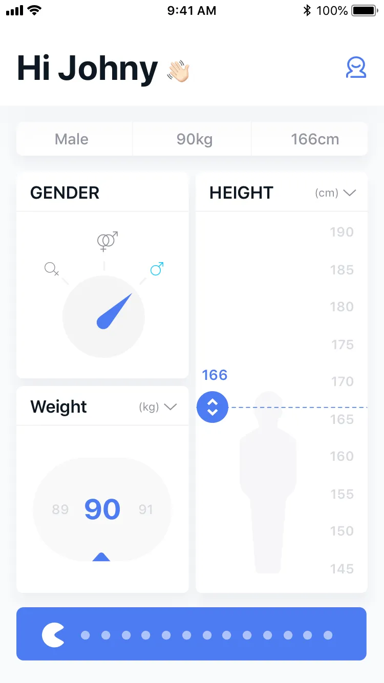
New design
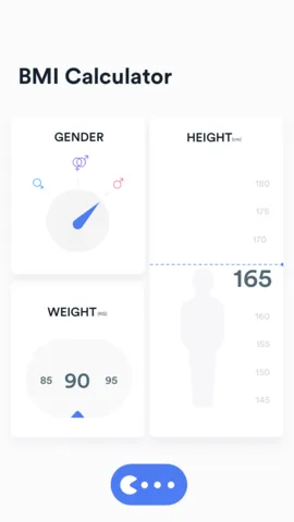
Old design
And the current state of the app looks like this:
Current state
What we need to do:
- Add app bar
- Add summary row
- Change card headers
- Change fonts
- Replace switch
App bar
First thing I wanted to do is use material design’s AppBar. Since our app is meant to be close to pixel perfect and our app bar is a bit larger than the material one, we won’t use AppBar widget but we will create our own one. However, we still want to use Scaffold‘s appBar field, because why not. To do that, we need to pass PreferredSizeWidget. The easiest way is to use PreferredSize which implements PreferredSizeWidget:
Widget build(BuildContext context) { return Scaffold( appBar: PreferredSize( child: BmiAppBar(), preferredSize: Size.fromHeight(appBarHeight(context)), ), body: ... );}What’s worth mentioning is how we should calculate the height of the widget. Since we are not using Material’s AppBar which was handling the status bar by its own, we have to take it into account by ourselves. To add status bar height to our app bar, we will use MediaQuery.of(context).padding.top. It will make sure that we are not drawing behind the status bar icons or the notch.
double appBarHeight(BuildContext context) { return screenAwareSize(80.0, context) + MediaQuery.of(context).padding.top;}screenAwareSize is a method used for scaling design specs to device’s screen, so that it will look very similar on all types of devices.
const double baseHeight = 650.0;
double screenAwareSize(double size, BuildContext context) {  double drawingHeight =      MediaQuery.of(context).size.height - MediaQuery.of(context).padding.top;  return size * drawingHeight / baseHeight;}
Now let’s just get into the code:
import 'package:bmi_calculator/input_page_styles.dart';import 'package:bmi_calculator/widget_utils.dart';import 'package:flutter/material.dart';
class BmiAppBar extends StatelessWidget {  static const String wavingHandEmoji = "\uD83D\uDC4B";  static const String whiteSkinTone = "\uD83C\uDFFB";
  @override  Widget build(BuildContext context) {    return Material(      elevation: 1.0,      child: Container(        height: appBarHeight(context),        color: Colors.white,        child: Padding(          padding: EdgeInsets.all(screenAwareSize(16.0, context)),          child: Row(            crossAxisAlignment: CrossAxisAlignment.end,            mainAxisAlignment: MainAxisAlignment.spaceBetween,            children: <Widget>[              _buildLabel(context),              _buildIcon(context),            ],          ),        ),      ),    );  }
  Padding _buildIcon(BuildContext context) {    return Padding(      padding: EdgeInsets.only(bottom: screenAwareSize(11.0, context)),      child: Container(        height: screenAwareSize(20.0, context),        width: screenAwareSize(20.0, context),        child: Placeholder(color: Theme.of(context).primaryColor),      ),    );  }
  RichText _buildLabel(BuildContext context) {    return RichText(      text: TextSpan(        style: DefaultTextStyle.of(context).style.copyWith(fontSize: 34.0),        children: [          TextSpan(            text: "Hi Johny ",            style: TextStyle(fontWeight: FontWeight.bold),          ),          TextSpan(text: getEmoji(context)),        ],      ),    );  }
  // https://github.com/flutter/flutter/issues/9652  String getEmoji(BuildContext context) {    return Theme.of(context).platform == TargetPlatform.iOS        ? wavingHandEmoji        : wavingHandEmoji + whiteSkinTone;  }}
So what’s happening:
- We are using
Materialwidget so that we can add a smallelevation. Elevation will cause a widget to be above the background, therefore, it will cast a shadow. - The AppBar’s content is a Row packed into a Padding. The row contains two elements: the label and the icon.
- Since I don’t have the actual icon yet, I’ve put a placeholder there. This way we can see that something is there to come and we will not forget about it before the release. We will talk more about
Placeholderlater on.
When it comes to the label and emojis, things get a little tricky:
- I didn’t manage to put an emoji into the code just by copy-paste (damn you IntelliJ), so I had to paste the Unicode (you can get it from here).
- But… in the texts, we can only use 4 digit unicodes, so we have to split one 5-digit symbol into two 4-digit ones (converter).
- To add a skin tone, we need to place an emoji and the skin tone side by side.
- Unfortunately, there is a bug, causing emojis to disappear when using bold font weight. To avoid it, we are using
RichTextwidget and applying bold weight only to the text. - To make things even harder, there is another bug on iOS, preventing us to apply skin tone there. The least we can do is check platform and apply skin tone only for Android devices.
The result:
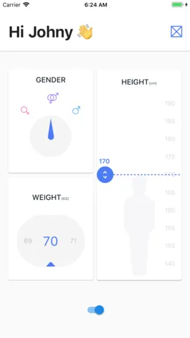
iOS
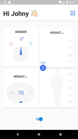
Android
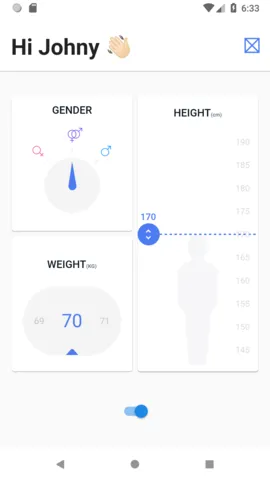
The app bar itself looks nice, but the status bar’s color is not what we wanted, it should be white with dark icons. On iOS it is like that on default so we only need to handle Android case. To fix that we will change SystemUiOverlayStyle in app’s main method:
void main() { SystemChrome.setSystemUIOverlayStyle( SystemUiOverlayStyle( statusBarColor: Colors.white, //top bar color statusBarIconBrightness: Brightness.dark, //top bar icons systemNavigationBarColor: Colors.white, //bottom bar color systemNavigationBarIconBrightness: Brightness.dark, //bottom bar icons ) ); runApp...}We have also changed the navigation bar color so that it better matches the whole app:
iOS
Android
Summary row
Moving fields to the input page
Now let’s move to the second part which I call “Summary row”. That widget is meant to show the values chosen by a user. To do that, we have to have access to those values, unfortunately, while creating gender, weight and height widgets I designed them to be StatefulWidgets and store their values by themselves.
Let’s take a look at the HeightCard widget:
class HeightCard extends StatefulWidget {  final int height;
  const HeightCard({Key key, this.height}) : super(key: key);
  @override  HeightCardState createState() => HeightCardState();}
class HeightCardState extends State<HeightCard> {  int height;
  @override  void initState() {    super.initState();    height = widget.height ?? 170;  }...  onChange: (val) => setState(() => height = val),...
It received initial height in a constructor and after that, whenever a user changed the height, it simply called setState to update the height. Now let’s see how it will look like if we want to move that height field one level above:
class HeightCard extends StatelessWidget {  final int height;  final ValueChanged<int> onChanged;
  const HeightCard({Key key, this.height = 170, this.onChanged})      : super(key: key);...  onChange: (val) => onChanged(val),...
Now the HeightCard widget doesn’t store any values so it can be Stateless. It has the second parameter which is a function that should be called whenever value has changed. We only need to replace setState method with onChanged method and that’s it. We need to do it for all 3 “Card widgets”. Then let’s update input page:
class InputPage extends StatefulWidget {  @override  InputPageState createState() {    return new InputPageState();  }}
class InputPageState extends State<InputPage> {  Gender gender = Gender.other;  int height = 170;  int weight = 70;
  Widget build(BuildContext context) {    return Scaffold(      ...      body: Column(        crossAxisAlignment: CrossAxisAlignment.start,        children: <Widget>[          InputSummaryCard(            gender: gender,            weight: weight,            height: height,          ),          Expanded(child: _buildCards(context)),          _buildBottom(context),        ],      ),    );  }
  Widget _buildCards(BuildContext context) {    ...      child: GenderCard(        gender: gender,        onChanged: (val) => setState(() => gender = val),      ),    ...      child: WeightCard(        weight: weight,        onChanged: (val) => setState(() => weight = val),      ),    ...      child: HeightCard(        height: height,        onChanged: (val) => setState(() => height = val),      ),    ...  }}
Visually, nothing changes, all the widgets render exactly the same. However, right now we have access to all BMI parameters at any time and we can pass them to InputSummaryCard.
InputSummaryCard Widget
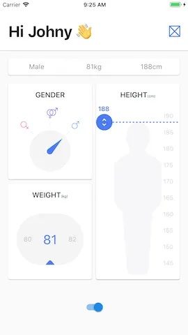
The widget itself is pretty straightforward. It will take 3 values as parameters: gender, weight, and height. The root widget will be a card, it will contain only one row. Row structure should be the following: text - divider - text - divider -text. Since we want the texts to take the same amount of space, we will wrap them inside Expanded widgets. I guess that’s everything worth mentioning. Let’s look at the code:
class InputSummaryCard extends StatelessWidget {  final Gender gender;  final int height;  final int weight;
  const InputSummaryCard({Key key, this.gender, this.height, this.weight})      : super(key: key);
  @override  Widget build(BuildContext context) {    return Card(      margin: EdgeInsets.all(screenAwareSize(16.0, context)),      child: SizedBox(        height: screenAwareSize(32.0, context),        child: Row(          children: <Widget>[            Expanded(child: _genderText()),            _divider(),            Expanded(child: _text("${weight}kg")),            _divider(),            Expanded(child: _text("${height}cm")),          ],        ),      ),    );  }
  Widget _genderText() {    String genderText = gender == Gender.other        ? '-'        : (gender == Gender.male ? 'Male' : 'Female');    return _text(genderText);  }
  Widget _text(String text) {    return Text(      text,      style: TextStyle(        color: Color.fromRGBO(143, 144, 156, 1.0),        fontSize: 15.0,      ),      textAlign: TextAlign.center,    );  }
  Widget _divider() {    return Container(      width: 1.0,      color: Color.fromRGBO(151, 151, 151, 0.1),    );  }}
And now let’s look at the result:
Summary Card
Card title
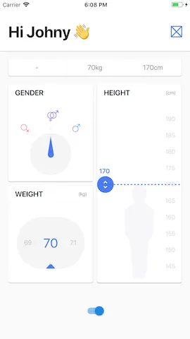
Next step is to change card titles. Luckily, the view is very simple. All we need is a column with 2 elements: row and divider. The row consists of two texts with different styles. To make them aligned to left and right we will use MainAxisAlignment.spaceBetween. I guess the code explains it the best:
import 'package:bmi_calculator/widget_utils.dart';import 'package:flutter/material.dart';
const TextStyle _titleStyle = TextStyle(  fontSize: 16.0,  fontWeight: FontWeight.w600,  color: Color.fromRGBO(14, 24, 35, 1.0),);
const TextStyle _subtitleStyle = TextStyle(  fontSize: 11.0,  color: Color.fromRGBO(143, 144, 156, 1.0),);
class CardTitle extends StatelessWidget {  final String title;  final String subtitle;
  const CardTitle(this.title, {Key key, this.subtitle}) : super(key: key);
  @override  Widget build(BuildContext context) {    return Column(      children: <Widget>[        Padding(          padding: EdgeInsets.only(            top: screenAwareSize(8.0, context),            left: screenAwareSize(13.0, context),            right: screenAwareSize(11.0, context),            bottom: screenAwareSize(8.0, context),          ),          child: Row(            mainAxisAlignment: MainAxisAlignment.spaceBetween,            children: <Widget>[              Text(                title,                style: _titleStyle,              ),              Text(                subtitle ?? "",                style: _subtitleStyle,              )            ],          ),        ),        Divider(          height: 1.0,          color: Color.fromRGBO(143, 144, 156, 0.22),        ),      ],    );  }}
It results in such look:
Card titles
Fonts
Now it’s time to change the font to the one I got from my awesome designer Johny. First, we need to put downloaded font files into the project folder. In my case, it will be fonts directory:
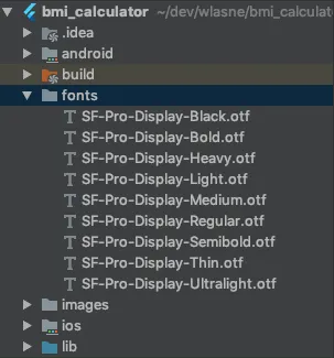
Then we need to update pubspec.yaml file where we link font weights to actual files:
name: bmi_calculatordescription: A new Flutter project.version: 1.0.0+1
dependencies:  flutter:    sdk: flutter  flutter_svg: ^0.5.5+1

dev_dependencies:  flutter_test:    sdk: flutter
flutter:  uses-material-design: true  assets:  - images/  fonts:  - family: SF Pro Display    fonts:    - asset: fonts/SF-Pro-Display-Ultralight.otf      weight: 100    - asset: fonts/SF-Pro-Display-Thin.otf      weight: 200    - asset: fonts/SF-Pro-Display-Light.otf      weight: 300    - asset: fonts/SF-Pro-Display-Regular.otf      weight: 400    - asset: fonts/SF-Pro-Display-Medium.otf      weight: 500    - asset: fonts/SF-Pro-Display-Semibold.otf      weight: 600    - asset: fonts/SF-Pro-Display-Bold.otf      weight: 700    - asset: fonts/SF-Pro-Display-Heavy.otf      weight: 800    - asset: fonts/SF-Pro-Display-Black.otf      weight: 900
Then the only part left is to use fontFamily specified in pubspec.yaml in the ThemeData:
class MyApp extends StatelessWidget { @override Widget build(BuildContext context) { return MaterialApp( title: 'BMI Calculator', theme: ThemeData( primaryColor: mainBlue, fontFamily: 'SF Pro Display', ), home: InputPage(), ); }}The changed font might not be noticeable at a first glance but believe me, it has changed 🙂
Slider placeholder
When I started this app I didn’t know about Placeholder widget. Placeholder is a great widget for, well… holding the place in a screen. If there is a widget, that you know it will be there but you haven’t implemented it yet, you can put a Placeholder to indicate it will get there sooner or later. In my case I will put one on the bottom to indicate slider which will be implemented in the next part:
Widget _buildBottom(BuildContext context) { return Padding( padding: EdgeInsets.only( left: screenAwareSize(16.0, context), right: screenAwareSize(16.0, context), bottom: screenAwareSize(22.0, context), top: screenAwareSize(14.0, context), ), child: Placeholder( fallbackHeight: screenAwareSize(52.0, context), color: Theme.of(context).primaryColor, ), );}I have also done other minor changes to the app like greying out gender icons that were not selected or changing the margins, however, it was waaay too boring to put it into the post, so I guess we need to finish here :).
Let’s compare what we got with the design:
The design
The final result
And that’s it! 🙂
You can find the full code for this part on GitHub.
Cheers 🙂